CLINICSCO-OP
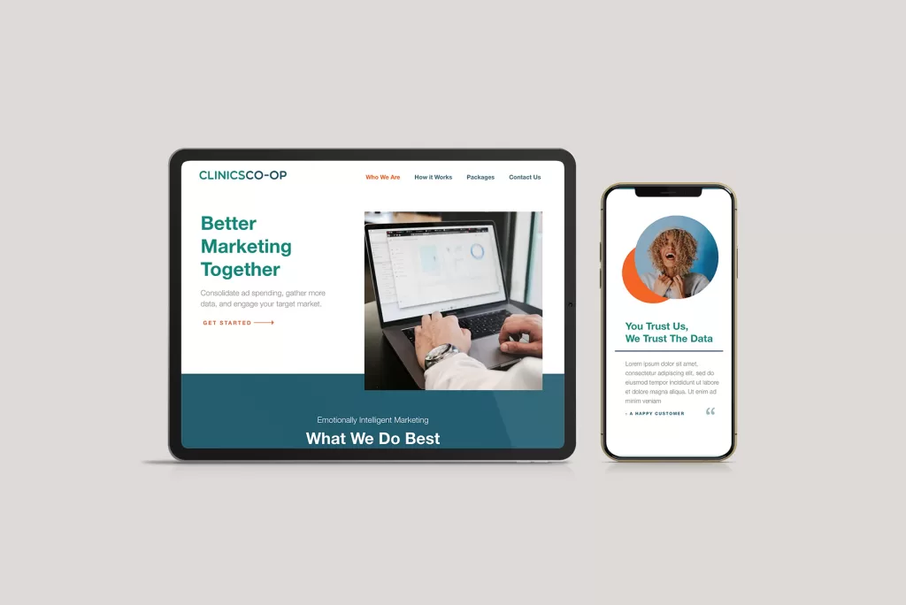
Creating the CLINICSCO-OP website was an exercise in balancing clarity with functionality, all while fostering a sense of trust and understanding. As a UX designer and developer, my role was to construct a digital platform that seamlessly connects physical medical clinics with the digital marketing services they need. The project’s core goals were clear: build trust with medical clinics, sell digital marketing services, detail service features, simplify subscription packages, showcase social proof, and capture leads. Here’s how we approached each of these aspects through thoughtful UX design and development.

Simplifying Complex Services
Understanding that our audience might not be tech-savvy, simplifying complex digital marketing services into clear, understandable terms was crucial. This meant breaking down services into digestible components, using language that resonates with medical professionals. We achieved this through an iterative process of content refinement and user testing, ensuring that our message was both accessible and engaging.
Designing for Trust
Trust is paramount when dealing with medical professionals. To instill this, we focused on creating a design that was professional, clean, and reassuring. This involved choosing a color palette that conveyed reliability, crafting a layout that felt organized and logical, and selecting imagery that reflected the professionalism of the medical field. Incorporating testimonials and case studies prominently on the site provided the social proof needed to reassure potential clients of our credibility.
Subscription Packages, Demystified
One of the primary challenges was presenting subscription packages in a way that was easy to understand yet detailed enough to convey their value. We designed comparison tables and feature lists that highlighted the benefits of each package clearly. Interactive elements allowed users to explore different tiers of service, understand what was included at each level, and make informed decisions based on their specific needs.
Streamlining the Lead Capture Process
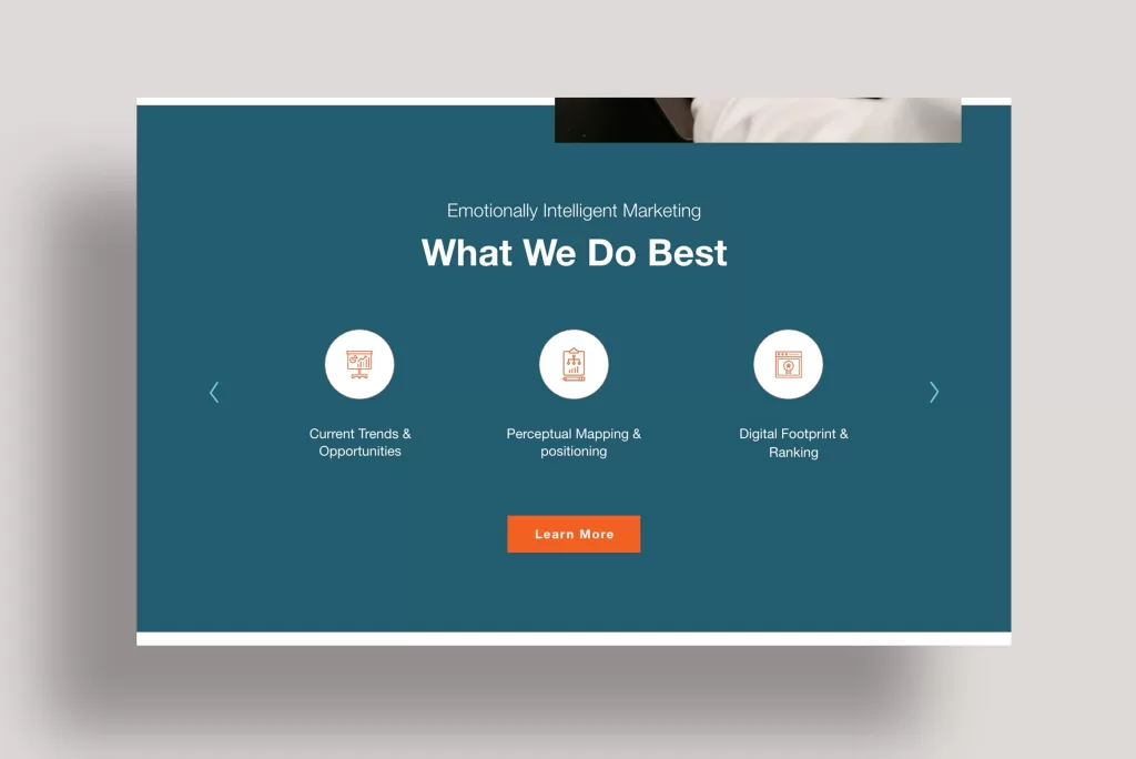
Capturing leads was a fundamental objective, so optimizing the user journey towards making an inquiry was essential. We implemented strategically placed call-to-action (CTA) buttons that were visually distinct and used compelling language. Forms were designed to be straightforward, asking for essential information upfront and providing options for users to learn more without feeling pressured. The development side ensured these forms were quick to load and easy to use, regardless of the device.


