Dixon
Patterson
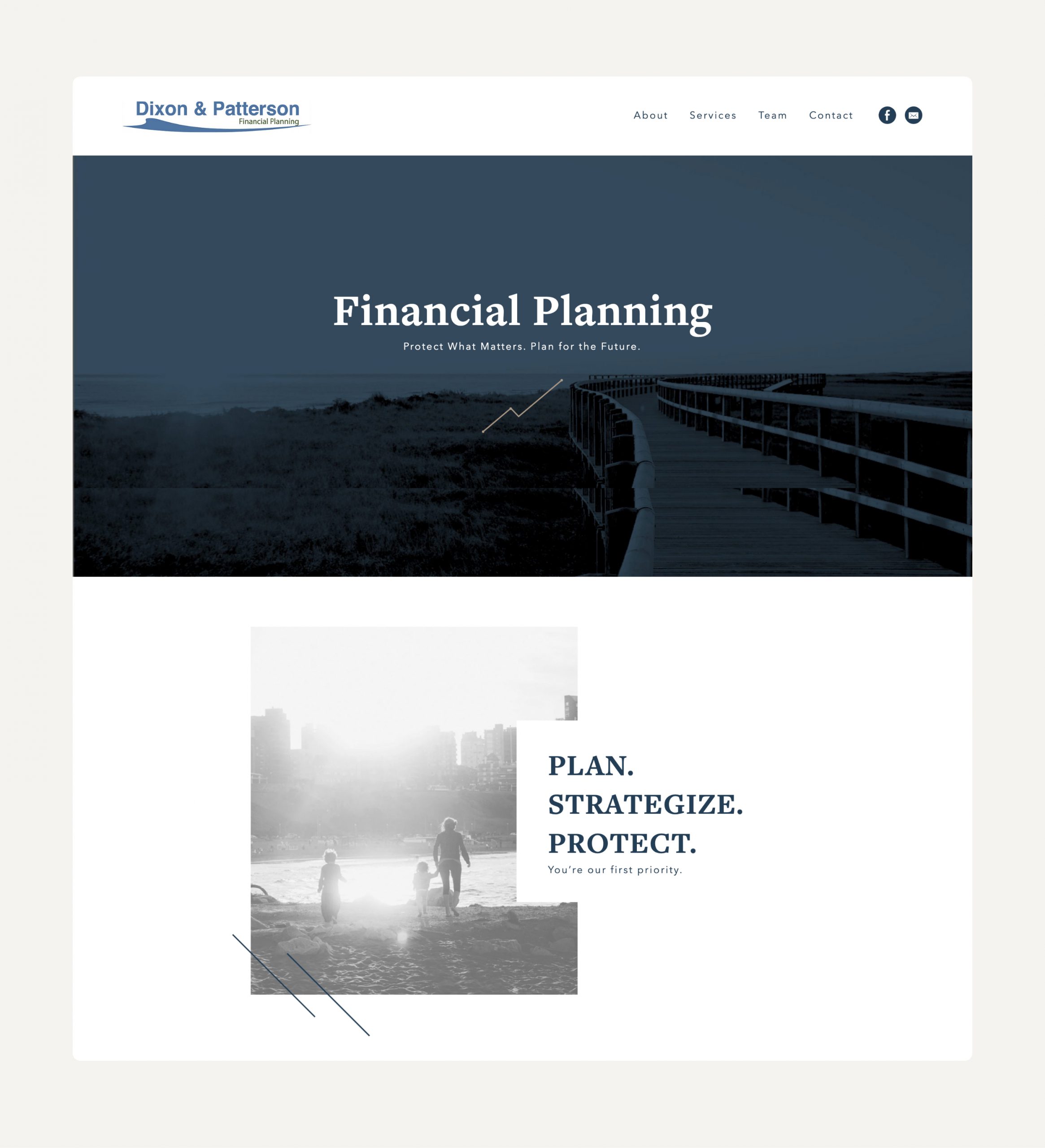
The objective for Dixon Patterson, a financial planning agency, was clear: modernize their web presence with a marketing website that would encapsulate their services in a concise yet engaging manner. As both the designer and developer, my challenge was to create a single-page experience that would not only provide all necessary information in an accessible way but also embody the agency’s professional ethos visually. This project demanded a seamless blend of design and development skills to reach a broader audience and generate leads effectively.
Website:

Visual Strategy for Single-Page Layout
The design process began with a focus on how to structure a vast array of information within the confines of a single page without overwhelming visitors. The solution was a clean, modern design that used space, color, and typography strategically to guide the visitor through different sections smoothly. Each segment of the page was carefully considered to ensure it was engaging and informative, using visual cues to lead visitors from one topic to the next, maintaining interest and clarity throughout.
Interactive Elements for Enhanced User Experience
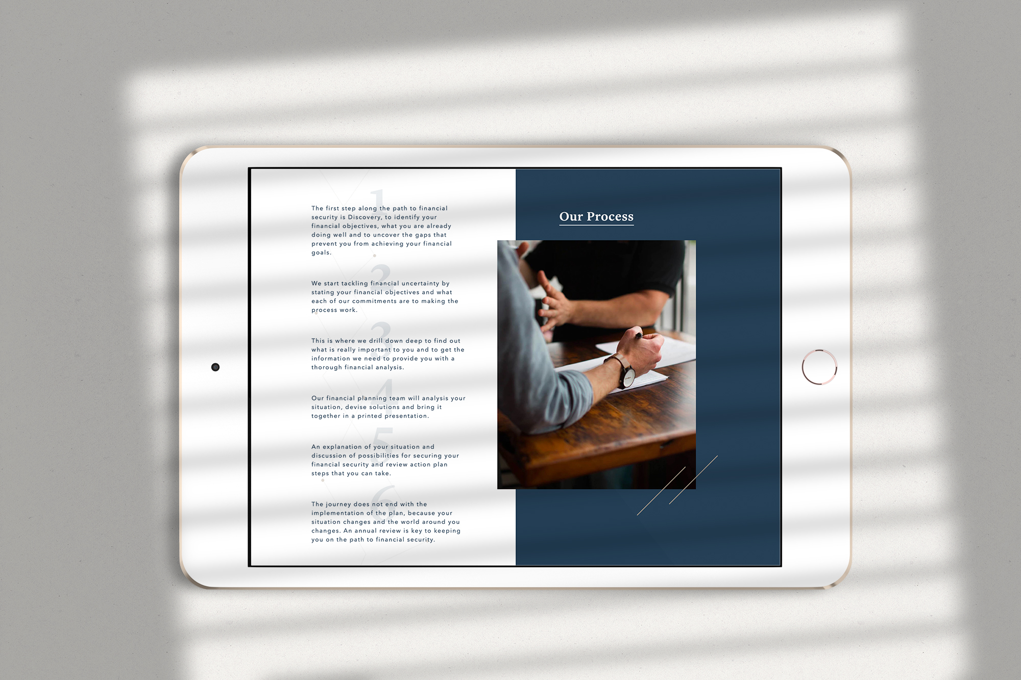
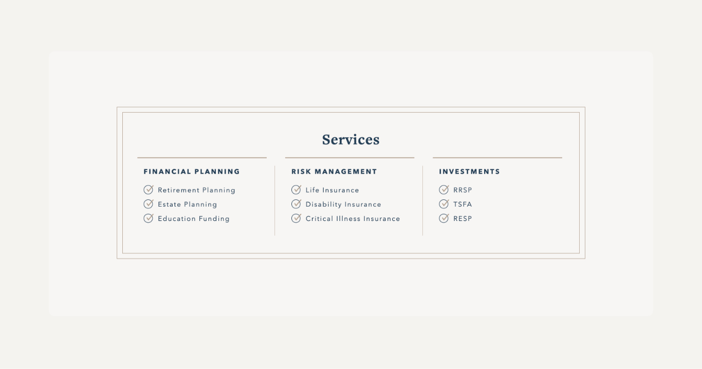
To make the financial concepts approachable and digestible, I incorporated interactive design elements. Custom icons, hover effects, and animated transitions were employed to bring life to the content, making the exploration of services an engaging experience for visitors. These elements were not only decorative but served to segment the information into bite-sized pieces, facilitating easier comprehension and retention of the services offered by Dixon Patterson.
Implementing Dynamic Content Blocks
On the development side, the focus was on translating the design vision into a functional website. Utilizing WordPress’s Gutenberg editor, I developed custom blocks that allowed for the unique presentation of content. This approach gave the site flexibility and scalability, ensuring that Dixon Patterson could update and adapt content as their services evolved. The custom blocks were engineered to support the interactive design elements, ensuring that the user experience was consistent and engaging across all devices.
Streamlined Lead Generation
A critical component of the website’s functionality was an intuitive lead generation system. Integrating bespoke forms and calls-to-action within the page design, I ensured that these elements were naturally woven into the user’s journey through the site. The design of these forms was clean and straightforward, encouraging visitors to engage without detracting from the overall aesthetic. Behind the scenes, these forms were optimized for conversion, with a straightforward backend process for tracking and managing leads.


