Photolab
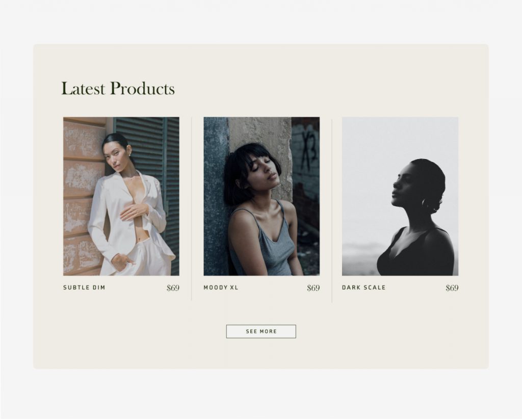
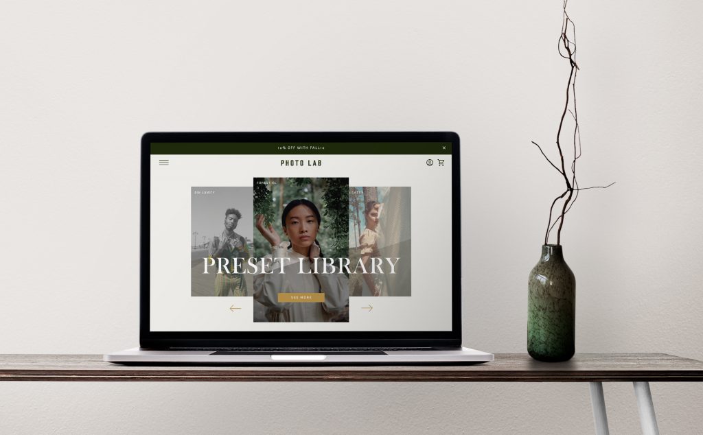
Photolab is designed as a moody, high-end Shopify theme for selling Lightroom Presets. It features many custom sections that cater to the target users. It elegantly displays the utilitarian functions of the storefront.
Crafting a Niche User Experience
Rotating Carousel for Dynamic Demonstrations
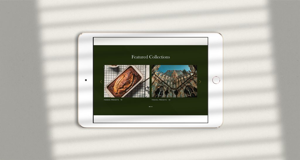
At the heart of Photolab’s homepage is a unique rotating carousel, ingeniously designed to spotlight the preset names alongside before-and-after imagery. This feature serves a dual purpose: it not only visually communicates the impact of our presets but also engages users by showcasing the practical application of our products. By enabling potential buyers to witness the transformative potential of our presets in real-time, we bridge the gap between curiosity and confidence.
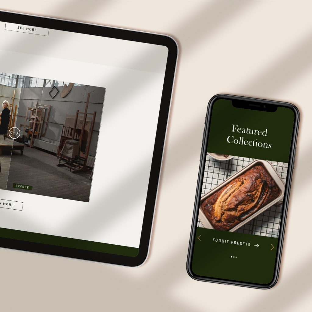
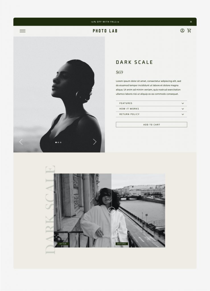
Interactive Before-and-After Slider
A pivotal element of our UX strategy is the custom-designed before-and-after slider. Sleek, branded, and inherently interactive, this slider allows users to experience the nuanced effects of our presets firsthand. This tactile interaction with our product catalog fosters trust and encourages a deeper exploration of our offerings, ensuring that users feel informed and confident about their purchasing decisions.
Designing Beautiful Navigation
Elegant Pop-Out Navigation
Understanding the importance of a seamless browsing experience, we developed a large, branded pop-out navigation system. Styled to reflect Photolab’s moody and elegant branding, this navigation effortlessly animates onto the screen, providing a clean, uncluttered gateway to our extensive preset catalog. The use of arrows to navigate through sub-menus ensures a fluid user journey, minimizing congestion and enhancing the overall aesthetic appeal of the site.
