Skin Nutricious
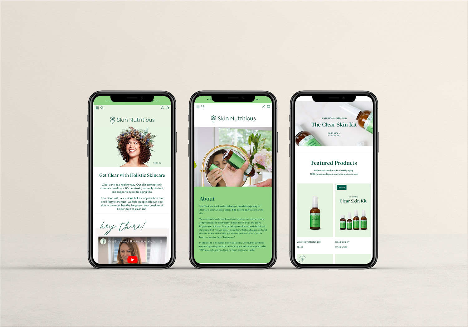
In the dynamic world of skincare, ‘Skin Nutricious’ represents a beacon of clarity and authenticity, aimed at educating and empowering its customers. As the Shopify developer tasked with bringing this vision to life online, I embarked on a journey filled with unique challenges and opportunities to create a platform that does more than sell products—it educates, inspires, and transforms. Here’s a glimpse into my role in building the ‘Skin Nutricious’ Shopify site.
Website:
Designer

The Vision: A Comprehensive Skincare Hub
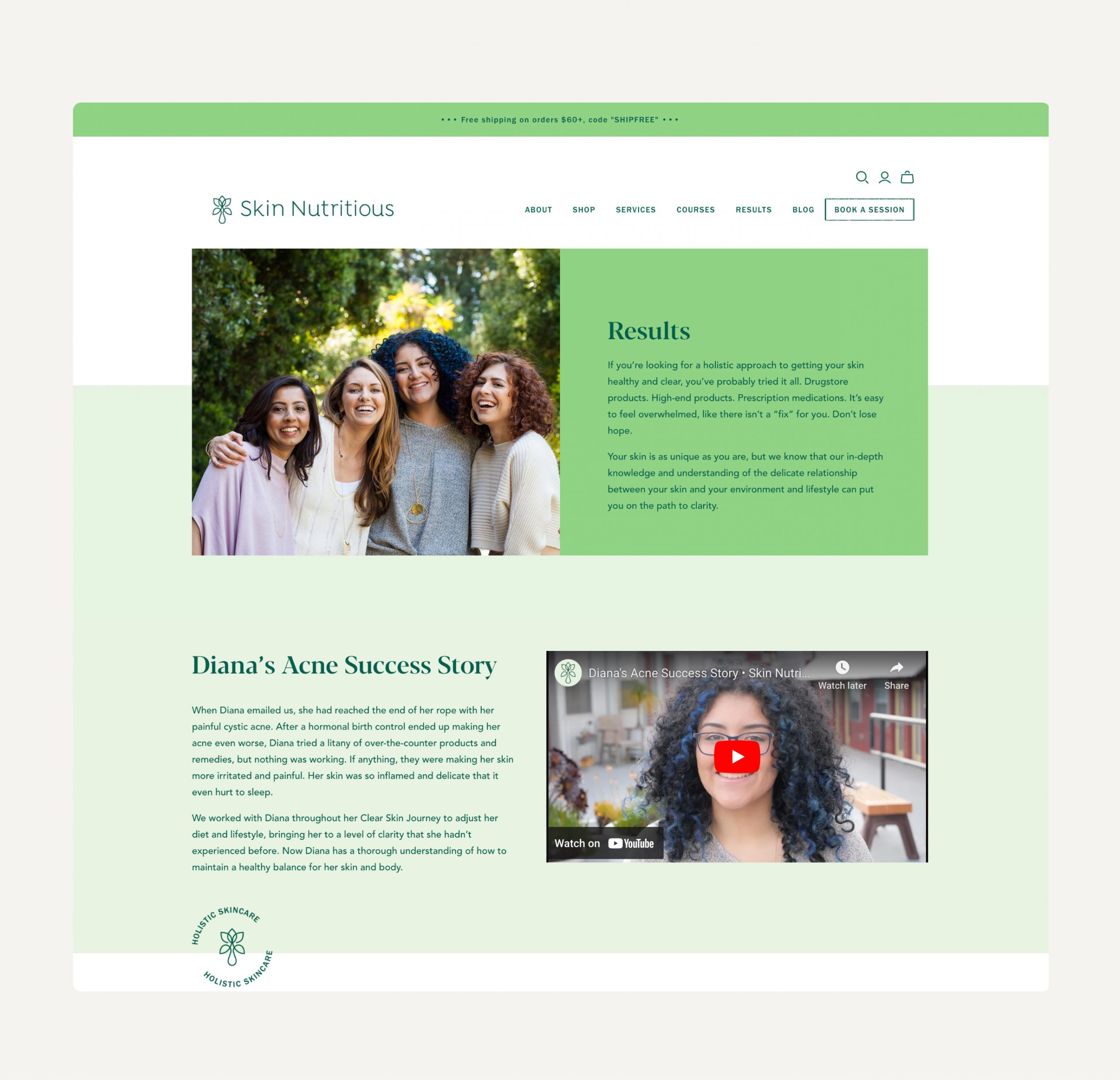
‘Skin Nutricious’ sought to differentiate itself by providing extensive educational content alongside its product offerings. This meant incorporating detailed product information, videos, before-and-after images, an in-depth blog, and a comprehensive FAQ page. My goal was to design a site that not only showcased their products but also served as a hub for skincare education and advice.
Custom Shopify Sections and Page Templates
One of the primary challenges was developing custom Shopify sections and page templates that were both user-friendly and easily customizable. The ‘Skin Nutricious’ team needed the ability to update content regularly without diving into complex code. Utilizing Shopify’s Liquid templating language, I created a series of custom sections that could be easily added, removed, or edited through the Shopify admin interface. This modular approach allowed for the seamless integration of educational content, videos, and visual proof of the products’ efficacy.
Integrating a Custom Blog Filter Navigation
To enhance the educational aspect of the site, ‘Skin Nutricious’ required a blog that could house a wealth of information across various skincare topics. Creating a custom blog filter navigation system was essential to ensure visitors could easily find the content most relevant to their skincare needs. This involved developing a custom filtering system that categorized blog posts by topic, concern, and product type. Through careful integration with Shopify’s APIs and leveraging JavaScript for a smooth user experience, the blog became an invaluable resource for anyone looking to improve their skincare regimen.
Multiple Funnel Inputs for a Seamless User Journey
Recognizing that the customer journey doesn’t follow a single path, integrating multiple funnel inputs throughout the site was a crucial consideration. From educational blog posts and FAQs to product pages, every piece of content was designed with conversion in mind. Strategically placed call-to-action (CTA) buttons and links encouraged users to explore products related to the content they were consuming, effectively guiding them from education to purchase.


